The Toronto Raptors “Classic Court Edition” was reportedly leaked yesterday. If the leaks are true, the court is a wonderful callback to the 90s.
Everyone loves nostalgia. Nostalgia is why Stranger Things is such a hit, why shows like Fuller House are on Netflix, and why Disney makes a “live-action remake” every other month (did we really need Lady and the Tramp remake). The Toronto Raptors are betting on nostalgia.
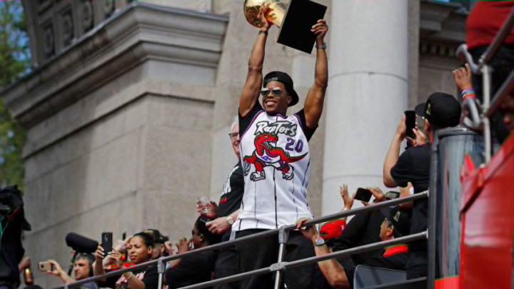
When the Toronto Raptors were first introduced, many laughed at the team name and design. Thought of as a part-time dinosaur blip due to the popularity of Jurassic Park, “Raptors” was far from conventional. To then pair it with purple, of all colors, the franchise was taking a risk. Out of that risk, the Barney Uniforms were born.
Stuffy nosed traditionalist didn’t like it. These weren’t classic sleek designs like the Boston Celtics or Los Angeles Lakers. They were big, bold, in your face, with a giant freaking dinosaur on the front.
When discussing the Toronto Raptors original uniforms, Paul Lukas of uniwatch, didn’t mix words claiming:
"“[NBA uniforms] had a sense of dignity about them, and around the mid-1990s, the NBA and their creative team decided basically to throw dignity out the window and go with a much more flamboyant approach,”"
He’s absolutely right. The Raptors uniforms threw dignity and grace out the window. Good.
At the end of the day, this is a game. A game I watch nearly every second of, spend hours writing about, and spend even longer thinking about. Still, it’s a game. We don’t need every uniform to be a call to grace and dignity. Some things can just be fun.
That’s what the Raptors are going with their new/throwback court design. Nostalgia and fun. The “leaked” court looks absolutely fantastic, and if it’s real it’s going to be spectacular.
Leaked “Classic Edition Court” for the Raptors this upcoming season 👀 via @NBA_Reddit pic.twitter.com/sjfrot8GUY
— Yahoo Sports Canada (@YahooCASports) August 23, 2019
You start with the traditional logo at center court. Obvious, but needed to be done. The secondary logos on the baseline are a nice touch. They could have gone bland. Instead, they took an appropriate risk.
However, the two things that set this court apart is the purple paint inside the three-point arc (beautiful) and the trailing path of Raptors claws across the court (genius). You could argue that the grey claws could be a more team-based purple and red, but the court already has a lot going on. It made sense to subdue the crazy color scheme a bit.
Would 41 games of this court be a little too much? Maybe. Kyrie Irving — who thought the Buck’s Mecca court was actually from the 1970s — certainly wouldn’t like it.
But what was once flamboyant and absurd, slowly becomes beloved over time. The Raptors new court design brings back a sense of joy and nostalgia. Let’s just make sure the team just doesn’t perform like it did back then.
