Team Design
Let’s start by picking a name. There are so many directions we can take here. If you’re looking for local wildlife, Sablefish, Blue Heron, and Cougars are contenders (although that last one may be meme-worthy for all the wrong reasons).
Instead, let’s go with something simple: Rain. It rains in Vancouver a lot, like almost half of the year. Designing the logo should have an intuitive feel to it like the v’s being sharpened into a raindrop-like tear. Or a simple big “V” that is a raindrop.
The name also makes it easier to complement the city’s natural colours of blue and green. Picking a colour scheme that harkens back to the ol’ Grizzlies design would be nothing but nostalgia.
A team in Vancouver should wear the city’s natural colours of blue and green, not too different from the Canucks.
Although the Dallas Wings already took the green, blue, and navy colour scheme, Vancouver can set themselves apart with a different shade of each. A dark teal colour would be a unique colour as the primary. As the secondary, bring back the classic Grizzlies turquoise.
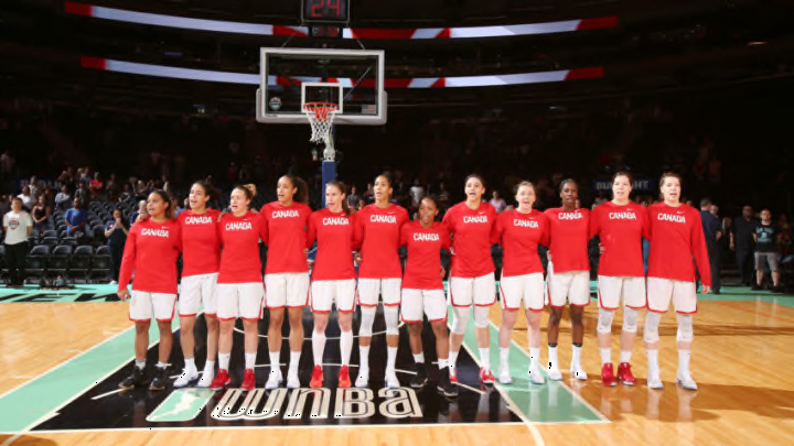
As an alternative or third colour/jersey, bring on the Team Canada colours.
