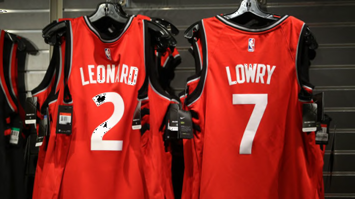
The Toronto Raptors haven’t been around for very long when compared to some of the other franchises out there, but they have had plenty of wardrobe changes, often with some mixed results.
The Raptors have changed color schemes from purple to red, and recent years have seen them really lean into their “We The North” slogan with the “Raptors” wordmark across the jersey arranged in a chevron across the front of the jersey.
While the Raptors’ jerseys have ranged from iconic to questionable over the years, one can never accuse the franchise of taking the easy way out, as they have usually chosen uniqueness over the safe approach.
However, it’s fair to say that the Raptors have their fair share of duds that the fanbase wished never got past the concept stage of design. Which jerseys stand out as the best in Raptors history, and which are some fashion faux pas that Toronto would like to consign to the waste bin?
Top 5 and bottom 5 jerseys in Toronto Raptors history
No. 5 worst: 2020/21 City Edition
The Raptors are all but forced into making one of their alternate jerseys black and gold due to their Drake partnership but this year’s look wasn’t perfect. The big claw marks on the side of the pants felt like they were trying too hard or running out of ideas for this color palette.
It’s by no means an awful jersey, but it feels like there’s a bit too much going with this, and it could’ve probably benefitted from one more workshop. The Raptors have had some hits with this colorway, but their effort last year may have been their weakest effort in this particular colorway.
Just missed the cut: White Toronto Huskies alternate (the blue jersey rocks)

No. 5 best: 2019/20 City Edition
Just one year before, the Raptors managed to nail their Drake-inspired collab. It has a much simpler, cleaner front, all while keeping the old school Toronto font that they made famous on their inaugural jerseys in the 1990s. The back also featured the same nameplate from their 90s days.
If the idea of these jerseys was to blend the new era of Raptors basketball with the forerunners from past seasons, this jersey perfected that. If the Raptors want to make more gold jerseys, following this more simplistic approach might be the way to create something that really pops.
Just missed the cut: 2006-2013 black alternate
