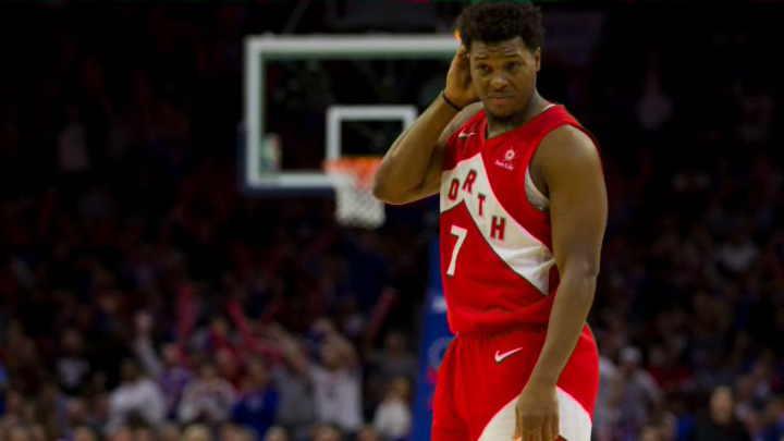
The Toronto Raptors have finally revealed three out of five new jerseys they’ll be wearing in the upcoming season.
It felt like just yesterday that the Toronto Raptors said they were going for a new look. Many were of the opinion that they’d bring back the beloved purple back into their color scheme. But the rumors holding the most weight did come out true, which is a look that revolves around their all so famous chevron.
The Raptors unveil three of the five uniforms that the team will wear next season. pic.twitter.com/C6hLg3rWfr
— Kayla Grey (@Kayla_Grey) October 15, 2020
The Toronto Raptors have gone back to what they won a championship with. The famous “North” jerseys were a hit when they came out and have become an iconic piece of their history when they beat the Golden State Warriors to win the championship in Game 6.
The red and white jerseys follow an identical pattern with the chevron in the center of the jersey and the shorts. The main differences are obviously the shade of red which is darker on the new one, the chevron is black, and it is written Raptors instead.
Now it’s time to get to business and put our fashion knowledge to the test.
The Proud (Red jersey)
It is worth noting that the Toronto Raptors named each jersey with a statement for what they stand for, the red one is known as “The Proud.”
"“An embodiment of the Raptor. Calculated. Always hunting. Marked by the untamed North, with impact always visible.”"
The statement is pretty meh which bodes well with the jersey. These were the first of the jerseys to actually be leaked and it was met with a lot of discontent. After seeing it again, I do like the new darker shaded red and Kyle Lowry does make it look that much better.
But I just can’t forget the initial thought twitter and I had on them when they were leaked. These jerseys just don’t hit a certain way as the other two do but that’s mostly because this jersey has a meaningless statement when compared to the other two and that’s okay. It is a completely new look.
Maybe we’ll get used to this jersey in the near future. However, for the moment being, these jerseys deserve a 7/10 and that’s just because Kyle Lowry makes it look that much better — if it was based on leaked photos alone it would’ve been hovering the 5 area.
Rating: 7/10
The True (White jersey)
"“A beacon of solidarity, uniting 5 on the floor, 11 on the bench and a fanbase across the globe. This is True North. “"
I like this statement a lot actually because this jersey is most alike to the championship jerseys which is what brought all of Canada together, as well as all the Raptors. Even the none basketball watchers watched the Raptors in the finals. From Montreal, Ottawa, Vancouver, Calgary… The whole nation was watching the Raptors as one.
This statement certainly rings “The True” (sorry) and the two colors compliment each other very nicely. Many wanted the Game 6 championship jerseys and this is the closest they’ll get. It is the same colors but just inverted.
This jersey looks good, makes us reminiscent of the championship, and it truly reminds us who the King of the North is — not Marcus Smart and the Celtics.
Rating: 9/10
The Defiant (Black jersey)
"“Heard through actions with self-made style. Self-proven but selfless, and not afraid to zig when they zag.”"
The meanest jersey out of the three, and one that symbolizes what the Raptors stood for a very long time. A team that is constantly underrated, that American sports networks never even shed a thought about — okay only Kendrick Perkins. The Raptors have always shown defiance through the years and ignored what the critics have said.
Their heart and unity as well as ability to try new things have always made them a challenging opposition for anyone they face — besides the LeBron-led Cavaliers. This third jersey pretty much reminds us of that.
The little zig-zags and red (lightning bolt?) give this jersey all the character it needs. It also adds a very 90’s ish style where lots of old jerseys liked to have slim stripes. It just looks very bad*** and I wouldn’t want to face the Raptors if they were wearing this jersey.
