No. 3 worst: 2006-2013 home
After shocking the basketball fashion world with some of the more weird jerseys we’ve seen, Toronto tried to modernize and simplify at the beginning of the Chris Bosh era. While these jerseys aren’t necessarily horrible, they feel like such a missed opportunity because of how basic they are.
Outside of the two silver chevrons on the side, nothing really stands out. It feels like this is the default jersey that comes with the jersey creation program starter pack. While they are somewhat memorable considering that Bosh’s prime years were spent in these uniforms, it’s a bit too milquetoast for my taste.

No. 3 best: 2013-19 home
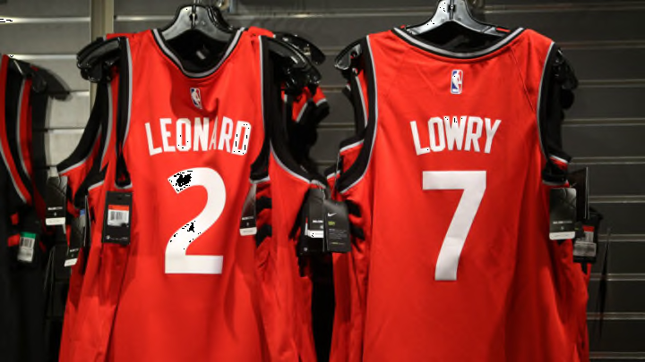
This jersey might’ve been hard to wrap your arms around at first to some, as it was a much more basic look than some of the funky combinations we’ve seen. However, with the slight arcing of the team name on the front and the nice red and silver piping, this is a solid blend of simplicity and pizzazz.
The best moments in the history of the franchise almost directly coincide with when they donned this look. Most of Kyle Lowry’s great moments and large chunks of their postseason success came with this look. Toronto might not have a ton of complaints from fans if they went back to this home look.
